I. Fragmentation of Andoid
1.Screen Sizes (small, normal, large and xlarge)

xlarge screens are at least 960dp x 720dp
large screens are at least 640dp x 480dp
normal screens are at least 470dp x 320dp
small screens are at least 426dp x 320dp
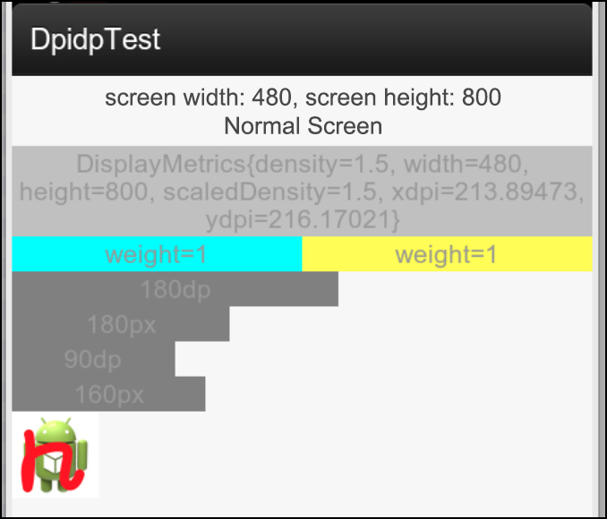
Below is the screenshot of Nexus4 (values-380dp)
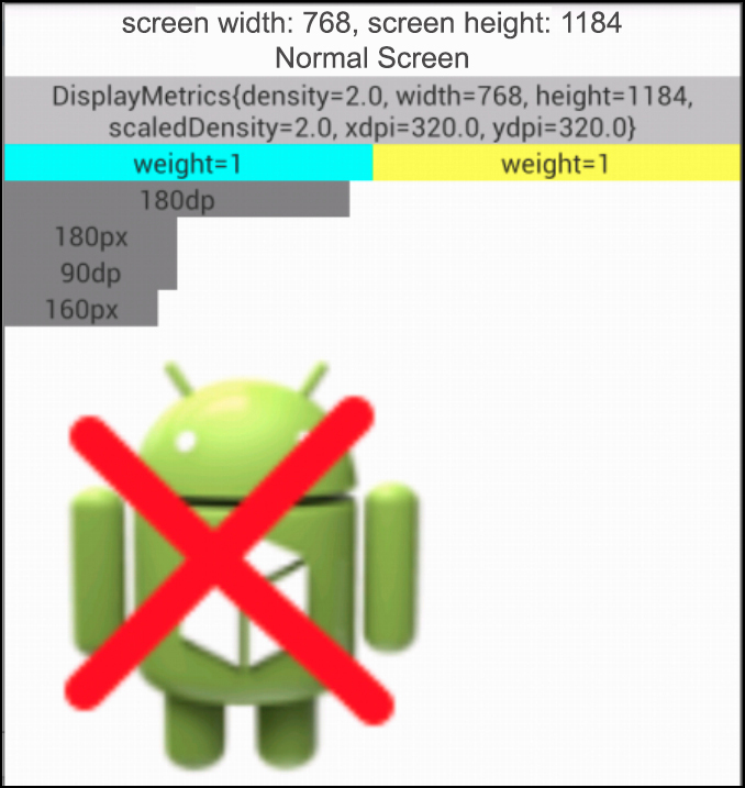
Below is the screenshot of Nexus7
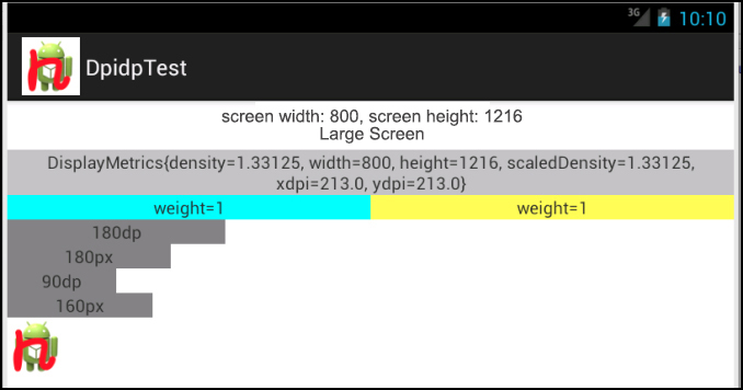
Below is the screenshot of Galaxy3
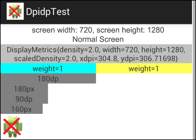
Below is the screenshot of Note2
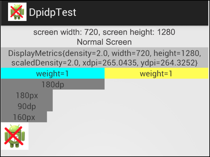
Below is the screenshot of htc g10
2.Resolution
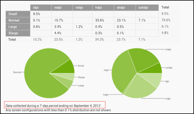
According to Google’s official stats, most Android’s screens are normal and most of the normal screens display a high resolution:
hdpi(800*480、854*480)33.6%
xhdpi(1280*720、1280*768)23.1%
3.Version
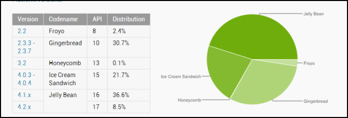
Mainstream versions on phones are2.3 and 4+;
Most versions on Android tablet are above 3.0;
Since very few tablets use the version s of 3.X, we could just consider the version of 4+.
II. Units of Android
1.px
px is banned in the development of Android.
2.dip(device indenpendent pixels)
3.sp (scaled pixels)
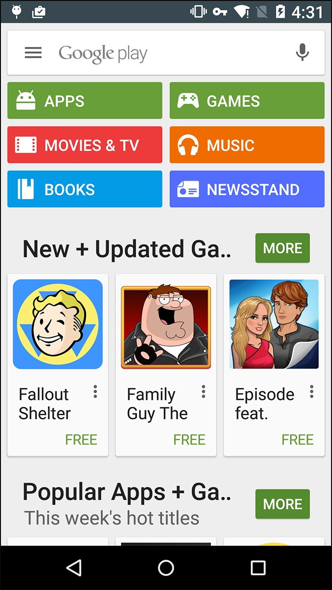
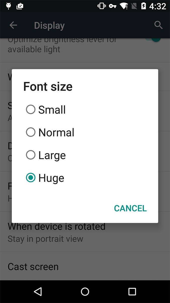
We have to use sp as the font unit because this way the font will adjust according to how the user set up his system font size.
On the screenshot below, you may find those huge sized fonts not being shown completely in Google Play.
4. dpi (device pixels per inch)
under the circumstance of same resolution, the smaller size the screen is, the higher dpi it is.
e.g.
device / resolution / density / dpi
note2 / 1280*720 / 2.0 / 260
galaxy3 / 1280*720 / 2.0 / 300
5.Conversion between px and dip
px=dip*density
e.g., 160px=80dip*2.0 (on note2 and galaxy3)
dip=px/density
e.g., 80dip=160/2 (on note2 and galaxy3)
III. Images in Android
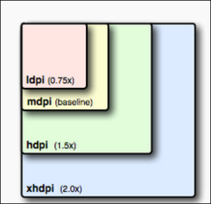
If you want to create an image which is 200px*200px for xhdpi, then you should also create accordingly images:
150dp*150dp for hdpi, 100dp*100dp for mdpi and 75dp*75dp for ldpi
How does an App select the image to display according to screen sizes? (based on dpi: xhdpi→hdpi→mdpi→ldpi)
160dpi is mdpi(will read images in mdpi folder)
240dpi is hdpi (htc g10 is 213dpi, so it will read the images in hdpi folder)
320dpi is xhdpi(galaxy3 is 300dpi and note2 is 260 dpi, so they will read images in xhdpi folder)
Another theory being:
when density=2, use xhdpi
when density=1.5, use hdpi
when density=1, use mdpi
when density=0.75, useldpi
Note: if the device is supposed to display the xhdpi image while there is actually no image in the xhdpi folder and there happens to be an image under the same file name in the hdpi folder, then the device will just display the hdpi image after stretch it proportionally.
That’s why sometimes the “xhdpi” image may look blurry.
Strategy of Image Display
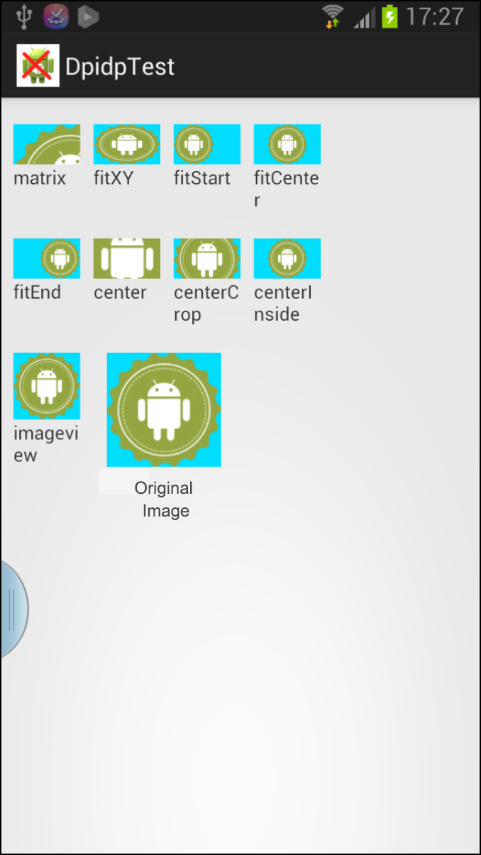
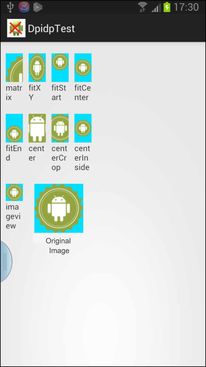
1.When Original Image is bigger than imageview.
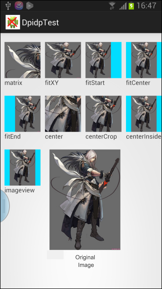
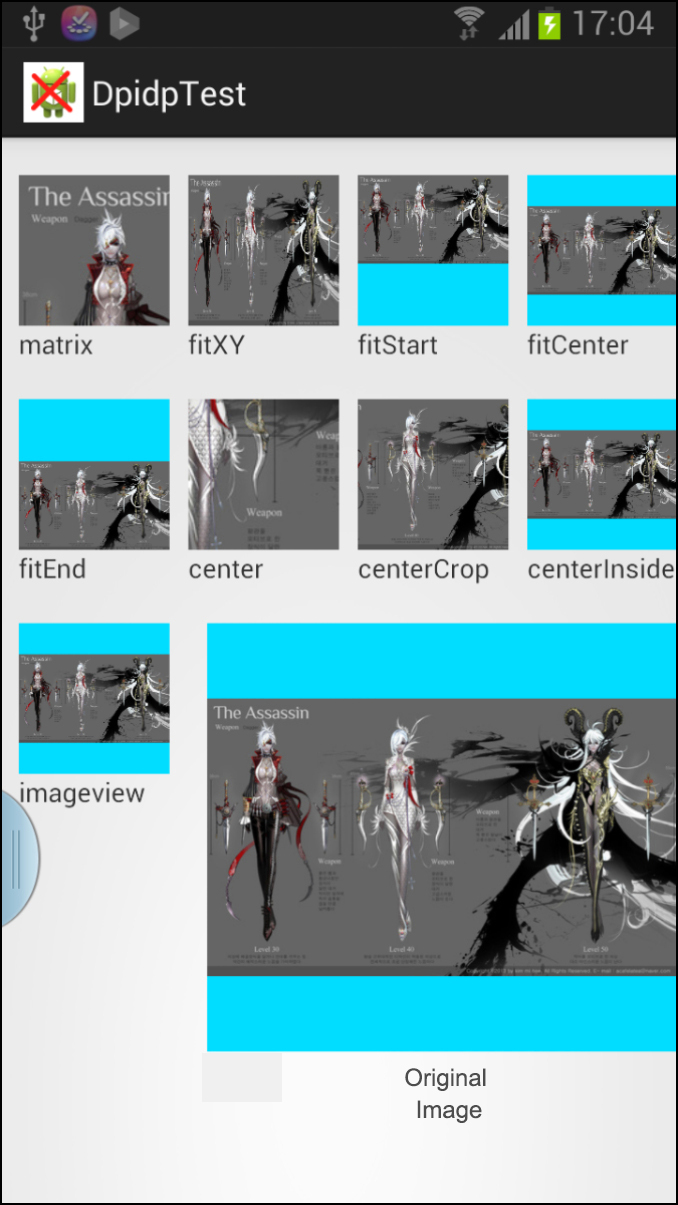
(Although there is no visual difference between fitCenter and centerInside on the screenshots below, in fact if the height of imageview is bigger than the original image, fitCenter will be displayed as the same height of imageview while centerInside in the middle of imageview.)
The first pair of screenshots are to show how the square imageview displays vertical and horizontal original images.
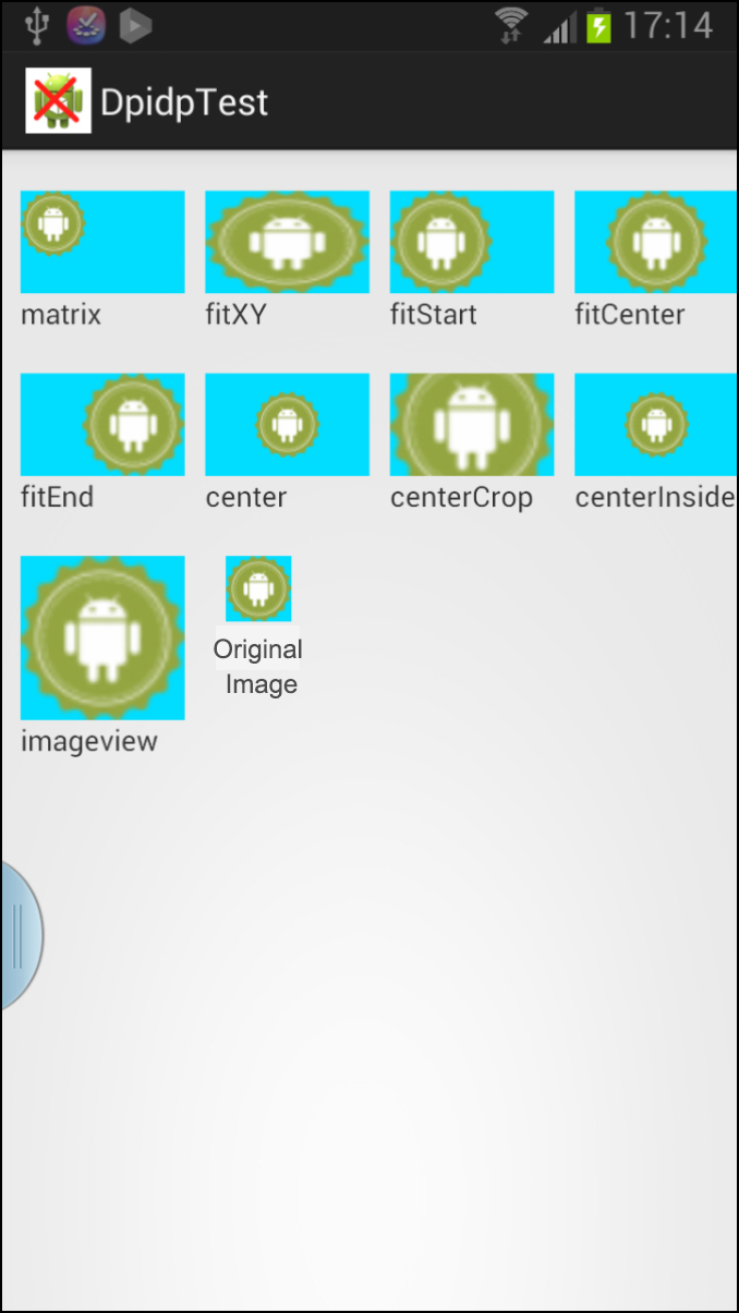
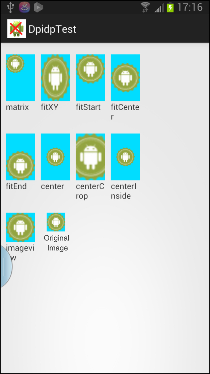
The second pair of screenshots below are to show how square image is displayed in vertical and horizontal imageviews.
2. When Original Image is smaller than imageview.
Layouts in Android (for solving compatibility problems)
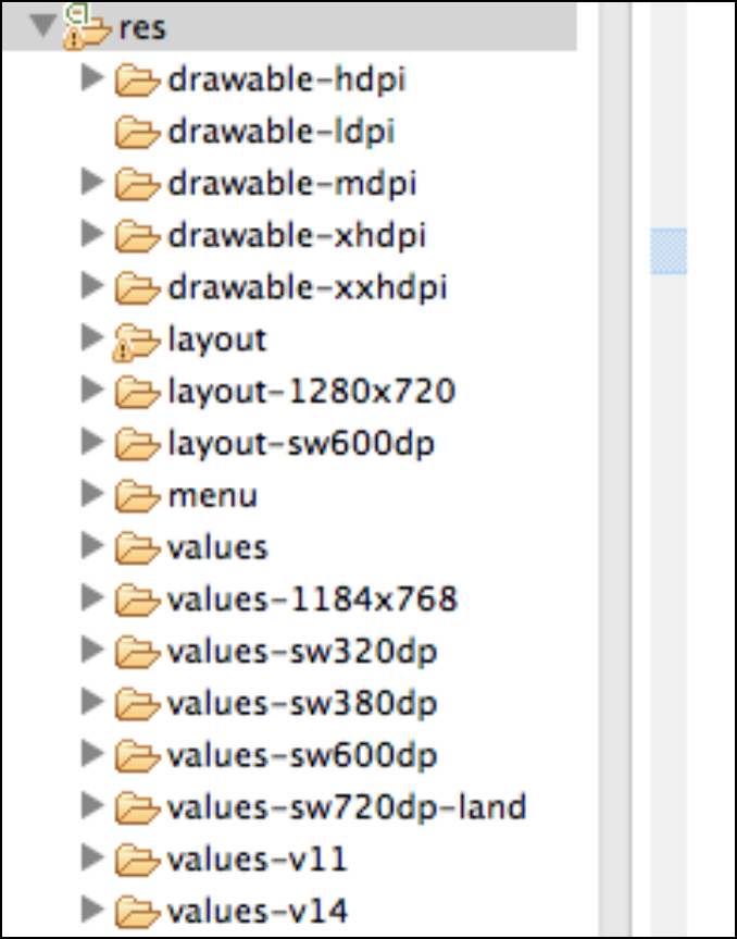
sw=smallestWidth
layout-1280×720 adapts for phones of 1280×720 resolution
layout-1184×768 adapts for Nexus4 (1280-96=1186, the 96px is the height of the bottom buttions on Nexus4)
layout/values-sw320dp adapts for Galaxy3 & Note2
layout/values-sw380dpadapts for Nexus4
layout/values-sw600dpadapts for 7-inch tablets
layout/values-sw720dp-landadapts for 10-inch tablets (horizontal version)
values-large-land-hdpi-1024×600//adapts for phones of 1024×600 resolution (big screen, horizontal version, hdpi)
References:
http://developer.android.com/guide/practices/screens_support.html
http://developer.android.com/about/versions/android-3.2.html
http://developer.android.com/training/multiscreen/screensizes.html
http://jsf.iteye.com/blog/1317093
http://blog.csdn.net/kesenhoo/article/details/7362575

